What Makes a Coin Attractive?
Steve: One of the features I enjoyed writing the most at Coin World was for the August 2016 American Numismatic Association World’s Fair of Money® issue that looked at some of the less attractive coins in the U.S. coin series and tried to position these coins in a broader discussion of aesthetics.
Many readers pointed out simplicity as a non-desirable factor in coin design. I wrote, “The silver 3-cent piece of 1851 to 1873 is frequently noted as being plain and unimaginative, though with a diameter of just 14 millimeters and a thinness that allows even basic usage to render it bent, one wonders what a better design might look like on this denomination.” Of course, one must acknowledge that designer James B. Longacre had a small canvas on which to work.
At the time Dennis called the issue “something of a ‘Sarah Plain and Small’ even in Mint State, and from there physical wear and tear takes them down a notch further.” He added that this opinion might have made him unpopular with trime collectors. 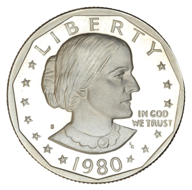 The Susan B. Anthony dollar of 1979 to 1981, revived in 1999 was another favorite “unpretty” coin from those surveyed. Orlando coin dealer – and recipient of an ANA’s honorary Doctorate in Numismatics – Don Bonser calls Frank Gasparro’s portrait of Anthony “rather stern and grim,” while George Cuhaj, former editor of the Standard Catalog of World Coins said, “The coin depicted her in older age, rather plainly.”
Consistent with the demographics of the hobby, a majority of the 50 friends I surveyed were male. Sculptor Heidi Wastweet defended the small-sized dollar, sharing with me, “I always thought it sad that this modest coin was that target of so much hatred. I don’t think the coin was sculpted badly. I think people were, at that time, just used to the only women on coins being idealized and beautiful. Beauty doesn’t seem to be a criteria of coin portraits of men. I say it’s time to let up. Susan had much more to offer than looks.”
ANA Money Museum curator Doug Mudd provided a sensitive reading, framing the Susan B. Anthony dollar not only in the context of the superficial, but looking at how a good portrait should reveal the character of the sitter. He shared, “The portrait does no justice to the great lady — she may not look like Elizabeth Taylor, but she did have character, and that does not come out in the portrait used on the coin, which likely contributed to its unpopularity.”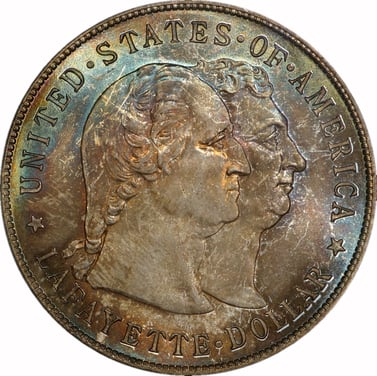 Indeed, nobody commented that George Washington looks jowly on John B. Flannagan’s Washington quarter dollar or that Christopher Columbus looks stern or tired on the 1892 and 1893 World’s Columbian Exposition commemorative half dollars. And let’s not even start on poor General Lafayette’s double chin on the 1900 Lafayette commemorative silver dollar.
Dennis, beyond your contempt for “trimes” what coin do you think doesn’t succeed from a design perspective?
Dennis: Here’s a design that I didn’t really like at first, but that’s grown on me: chief engraver Charles E. Barber’s Liberty Head, minted on dimes and quarters from 1892 to 1916, and half dollars from 1892 to 1915. Barber’s profile portrait of Miss Liberty has caught a lot of flack over the years for being “mannish.” It makes me think of the Bob Seger song “Turn the Page,” about the exhausting life of a rock musician, and these lyrics:
Well, you walk into a restaurant all strung out from the road
And you feel the eyes upon you as you’re shakin’ off the cold.
You pretend it doesn’t bother you, but you just want to explode.
Most times you can’t hear ’em talk, other times you can.
The same old clichés: “Is that a woman, or a man?”
And you always seem outnumbered, so you don’t dare make a stand. . . .
Masculine though it may be, Barber’s portrait of Miss Liberty is a bold, solid motif, easily recognizable even at a distance. And it held up well in circulation. On the quarter dollar it was replaced in 1916 by Hermon MacNeil’s Standing Liberty design—a lovelier work of art, but if a Standing Liberty quarter circulated for a few years, you have to squint to make out its flattened details. On Barber’s coins, relief elements wear down in a graceful aging process that leaves the surfaces elegantly antiqued and eye-pleasing.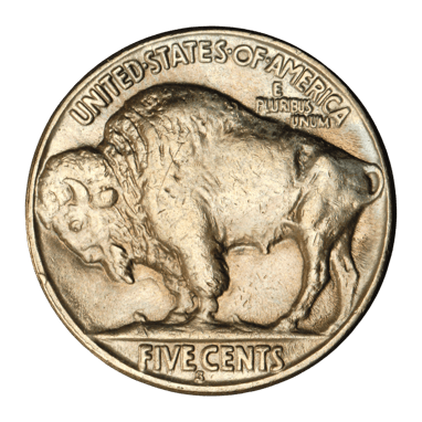 I think where the Barber coinage failed, from a design perspective, is more patriotic than aesthetic: Nothing about it specifically says “America.” In fact, the design is almost a mirror-image of the profile on French coinage of the era. Looking at the quarter dollar, you have to flip the coin over to find out where Miss Liberty is from. Today’s Americans, after decades of dead presidents on our coins, might be bored with George Washington, but with his portrait on the quarter you at least know it’s American. And nothing can compare to a coin that debuted in the twilight of Barber’s Liberty Head: the most uniquely American coin, the Buffalo nickel of 1913 to 1938. Charles Barber’s Miss Liberty was, in comparison, a bit of a Plain Jane and a lost opportunity. (The United States Mint has made up for it, though. Today’s coin collectors get 20 great American women on our circulating quarters from 2022 through 2025.)
Be on the lookout for another installment of Collecting Friends next month or subscribe here and never miss a post! In the meantime, explore beautiful coins from the ANA's Edward C. Rochette Money Museum Virtual Exhibits.
About the Collecting Friends Blog
Hello! And welcome to the ANA’s blog series, “Collecting Friends.”
We decided to approach this much like a conversation between friends. One of us starts with a topic, then the other responds. Simple as that. Along those lines, we’ll keep the tone conversational as much as possible.
We both write about coins professionally, and will keep our relative style guides in our writing. For Dennis, Publisher at Whitman Publishing, that means capitalizing “Proof” and italicizing Red Book and never saying anything bad about Ken Bressett, who’s awesome anyway.
For Steve, who’s written with Coin World for 15 years, it means Winged Liberty Head dime instead of “Mercury” dime, and similar nuances and oddities. And, it means writing A Guide Book of United States Coins (better known as the “Red Book”).
Both of us started collecting when we were little, introduced to coins by a chance encounter with an old coin that sparked our curiosity. One of Steve’s interests is coin valuation, and he gravitates towards the intersection of art and coins. Dennis enjoys medals and world coins, and studying modern U.S. coins in the context of older series, what came before.
We met in 2012 at the American Numismatic Association World’s Fair of Money in Philadelphia at an event hosted by the Austrian Mint where there was both a Ben Franklin and a Betsy Ross impersonator. We’ve become great friends in the past decade. We even were appointed together to sit on the Citizens Coinage Advisory Committee starting in 2016, but Steve resigned soon after he was appointed to accept a full-time job at the Treasury Department while Dennis was re-appointed in 2020.
We taught a course together on numismatic publishing and writing a few years ago at the Summer Seminar, and while life has gotten in the way of us teaching another class, we jumped at our friend Caleb’s suggestion that we write a column. We hope you enjoy it!
.png?width=300&height=300&name=steve%20roach%20circle%20frame%20(2).png)
.png?width=300&height=300&name=dennis%20tucker%20circle%20frame%20(2).png)
About the American Numismatic Association
The American Numismatic Association is a nonprofit organization dedicated to educating and encouraging people to study and collect coins and related items. The Association serves collectors, the general public, and academic communities with an interest in numismatics.
The ANA helps all people discover and explore the world of money through its vast array of educational programs including its museum, library, publications, conventions and numismatic seminars.